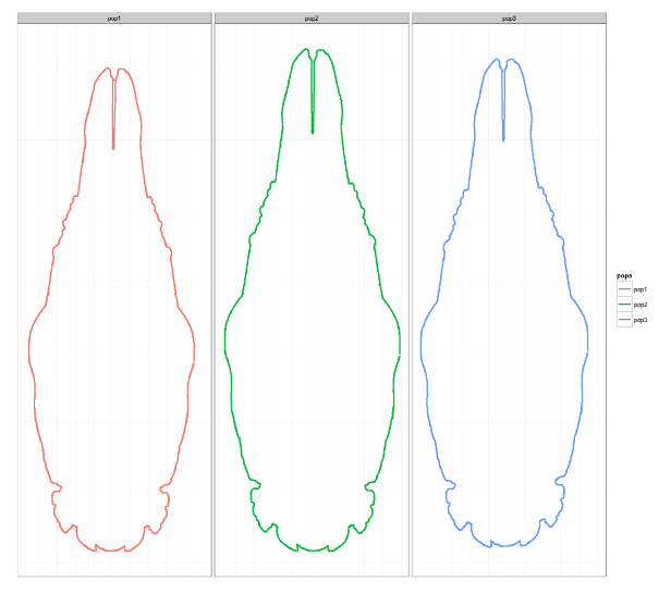
This procedure is based on the outlines generated from the digital photos using imageJ and converting imageJ images to x-y continuous outline data available from here. Its goal is to present a visual overview of global shape differences between individuals from natural populations, using landmark data from ventral projection of their crania. All outlines are based on deformation via Thin Plate Splines, using mean shapes for populations as deformation targets and references. Superimposition methods as well as preliminary GM analyses were done in R and marvelous geomorph package by Dean Adams and Erik Otarola-Castillo. Additionally, since one of the common points of contemporary scientific research is the reproducibility of solutions offered all posts will also contain randomly generated sample data that could be used similarly to real-world datasets. Sample generation can be very useful, especially in teaching, so I intend to focus on it in future posts.
1 2 3 4 5 6 | |
The workspace “capreolusRgen.RData” (which can be downloaded from here) contains several randomly generated datasetes of 657 individuals and 28 landmarks, named “capreolusSample#”. These data was generated on the basis of real-world values, using the linear regression model to control random number generators. The code that was used probably does not repoduce the sampling of landmarks well, especially regarding correlations between pairs of landmark coordinates or the landmarks that conform to the object symmetry, but for the purpose of illustration in this post, I hope they should be fine.
1 2 3 4 5 6 | |
Following the Procrustes superimposition is the calculation of mean shapes, both for all males and for separate populations. After mean shapes are calculated the only thing left is to use TPS in order to deform outlines (variable d), using mean shape of all males as a reference and mean shape of populations as target. This can all be done using Morpho R-package from Stefan Schlager.
1 2 3 4 5 6 7 8 9 | |
Finally, depicting shape changes can be achieved by wonderful Hadley Wickham`s ggplot2 R-package. This package has a neat way of “forcing” you to keep your data organized, so all variables are inside one data frame, both quantitative and qualitative.
1 2 3 4 5 | |

By inspecting outlines it can be seen that the individuals from pop1 are the smallest while the ones from pop2 are the largest. Shape differences are also determined by the relationship of length to width, so that individuals from pop2 have the widest crania, while the ones from pop1 have the narrowest. Also, it can be seen that in the individuals with the largest crania, size differences are detemined mostly by dimensions of the anterior part, maxillary and rostral regions, that are both wider and longer with respect to individuals with smaller crania. Posterior part of the cranium is more similar between individuals from different populations, and it may be more stable.