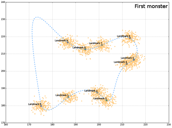
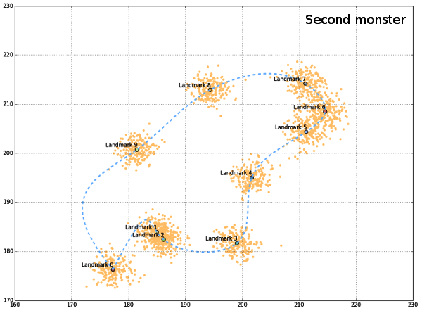
Generating random datasets is facilitated by powerful algorithms in both R and python that are capable of drawing random numbers from predefined distributions. For simulating geometric morphometric data the only important constraint is correlation between x and y coordinates of landmarks. Spacing of landmarks in also important, especially if the aim is to generte life-like data set, but it is not essential (hopefully) for morphometric analyses to work. Python scipy stack (numpy, scipy, pandas and matplotlib + Ipython console) is a great budnle which enables both random number generators and great visualizations. The code presented in this post uses all of these libraries, especially pandas, which offer the basic data structure used for storing landmark data, DataFrame. Also, it can just be pasted into Ipython console window (afer installing any of the scipy stack python distributions). The basic idea is to use uniform distribution random number generator (line 7) in order to generate ranges for the spacing of landmark groups, and then multivariate normal random distribution for creating the two-column correlated data (x, y coordinates, line 8). This code will simulate the situation with 10 landmarks recorded on 200 individuals. Spacing of landmarks can be controlled by the ranges of uniform generators (175-220 in code), and the spread of landmarks is contolled by input covariance matrix for multivariate normal generators ([[3,0],[0,3]] in code).
1 2 3 4 5 6 7 8 9 10 11 12 13 14 15 16 | |
allCoords contain all generated landmarks, while meanCoords is the collection of mean coordinates for each landmark. In order to visualize the generated data, a convenient “outline” can be drawn, connecting all landmarks smoothly. Since generated landmarks are not ordered in a way that permits simple connect-the-dots line between them, they should be rotated, and ordered differently. This can be done by using the centroid coordinates (from all landmarks) and the polar angle between the lines connecting centroid and each landmark. If polar angle is used, then landmarks (from meanCoords) can be ordered according to its value, clockwise. Polar angle can be calculated as the arctan between x and y coordinates of mean landmarks and the centroid.
1 2 3 4 5 6 7 8 9 | |
If a path would be drawn between the mean landmarks now, it would be irregular, and not too informative. One way of constructing the smooth connection between landmarks is to use interpolation algorithms that are part of scipy.interpolate. One issue with this approach is the connection between the first and the last landmark, since it must be added to points DataFrame as eleventh landmark, with x,y coords the same as for the first one, in order to complete the path. This added segment behaves erratically during interpolation so the generated figures might be distorted. But this will not happen always and all program routines could be re-run as long as the desired, nice, result emerges.
1 2 3 4 5 6 7 8 9 10 11 | |
Finally, plots are produced sequentially, first all landmarks, then mean landmarks, and finally the outline.
1 2 3 4 5 6 7 | |


Generated “monsters” are just there to get the idea of a possible shape, although the create the impression of the “outline”, such that all landmarks are sampled from the outer perimeter of the object. The code presented would not be complete if it wasn`t for the help from people from stackoverflow (here, here and here).