Creative morphometrics

Using R and python for colorful research of biological shape

R Generator and a Colorful PCA

As simple as it may seem, sample data generation is not a trivial task, especially when random landmarks are to be generated. Usually, one would use multivariate normal distribution-based generator (like mvrnorm in R`s MASS package) in order to generate correlated data. The following function was used to generate data similar to the real world datased, unfortunately based directly on it, by using the coefficients from regressions between successive columns in a data matrix, which represent landmark coordinates in XY data matrix. The following function uses this data matrix (446 individuals and 28 landmarks), and performs regressions between X-Y pairs for all coordinates. Finally it uses intercepts and slopes to infer mean and SD for rnorm function, random number generator.

Resampler function for random resamples of a real data matrix
1
2
3
4
5
6
7
8
9
10
11
12
13
14
15
16
17
18
19
20
21
22
23
24
25
26
27
28
29
30
31
resampler <- function(mat) #simulations based on rnorm random sampling
{
  x <- dim(mat)[1]
  y <- dim(mat)[2]
  indexrow <- c(2:x)
  combinations <- matrix(c(1:y,2:y), ncol = 2) #ignore the warning message
  slope <- numeric(y)
  intercept <- numeric(y)
  sds <- numeric(y)
  for(i in 1:y)
  {
    veca <- mat[,combinations[i,]][,1]
    vecb <- mat[,combinations[i,]][,2]
    model <- lm(veca~vecb)
    slope[i] <- coef(model)[2]
    intercept[i] <- coef(model)[1]
    sds[i] <- sd(mat[,combinations[i,]][,1])
  }
  coefs <- data.frame(intercept,slope,sds)
  cexox <- data.frame(c(1:x))
  for (i in 1:y)
  {
    dataCol <- rnorm(length(mat[,combinations[i,]][,2]),mean=intercept[i]+slope[i]*mat[,combinations[i,]][,2],sd=sds)
    cexox <- cbind(cexox, dataCol)
  }
  sampleMatrix <- as.matrix(cexox)
  sampleMatrix <- sampleMatrix[,-1]
  return(sampleMatrix)
}

resampledCap <- resampler(capreolusMatrix) #resample the original matrix-generate random coordinates

When the function finishes the output is also an XY matrix, which needs to be converted to an array in order to use it in gpagen function from the geomorph package. After that the procedure follows all the usual steps of the GM analysis, with the exception of factor levels generation in order to simulate grouping, and finally performing PCA on the Procrustes shape variables.

Basic GM procedures and factor level generation
1
2
3
4
5
6
7
8
9
10
library(geomorph)
capreolusArray <- arrayspecs(resampledCap, 28, 2, byLand = FALSE)
capreolusGPA <- gpagen(capreolusArray, ShowPlot = FALSE)
pop <- sample(5, 446, replace = TRUE) #generate random 5 population partition
pop[which(pop == 1)] <- "pop1"
pop[which(pop == 2)] <- "pop2"
pop[which(pop == 3)] <- "pop3"
pop[which(pop == 4)] <- "pop4"
pop[which(pop == 5)] <- "pop5"
capreolusGPA2d <- two.d.array(capreolusGPA$coords) #get the data in XY format for PCA

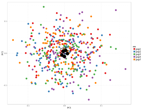
PCA is then done using the usual R`s prcomp function and ggplot2 for plotting the data points using fantastic ColorBrewer color schemes (which are the names of types and palettes in ggplot2 scale_color_brewer geom). In order to fine-tune the PCA figure, the ggplot2 can also use custom fonts for plot annotation. Prior to that, fonts must be imported and registered, which is greatly facilitated by using the extrafont library.

PCA and ggplot2 code for a PCA scatterplot
1
2
3
4
5
6
7
8
9
10
11
12
13
14
15
16
17
18
19
20
capPCAwhole <- prcomp(capreolusGPA2d)
capPCA <- data.frame(capPCAwhole$x[,1], capPCAwhole$x[,2], capPCAwhole$x[,3], capPCAwhole$x[,4])
capPCA <- data.frame(capPCA, pop)
names(capPCA) <- c("PC1","PC2","PC3","PC4","pop") #prepare a data.frame for ggplot2
meanPCA1 <- aggregate(capPCA[,1], mean, by = list(capPCA[,5])) #calculate average PC score per group for plotting
meanPCA2 <- aggregate(capPCA[,2], mean, by = list(capPCA[,5]))
meanPCA <- data.frame(meanPCA1, meanPCA2[,2])
names(meanPCA) <- c("pop","PC1","PC2")

library(extrafont) #for using i.e. Times New Roman Fonts in ggplots
font_import(pattern="[T/t]imes") #this imports Times font family
loadfonts(device="pdf")

library (ggplot2)
theme_set(theme_bw())
pcaplot <- ggplot(capPCA, aes(x=PC1, y=PC2, group = pop)) + geom_point(size = 7, shape = 19, aes(color=pop)) + scale_color_brewer(palette="Set1")
pcaplot <- pcaplot + theme(panel.grid.major = element_line(size = 0.8, linetype = 2)) + theme(panel.grid.minor = element_line(size = 1, linetype = 2))
pcaplot <- pcaplot + theme(text=element_text(size=20, family="Times New Roman"), legend.text=element_text(size = 22, family = "Times New Roman"), legend.title = element_text(family ="Times New Roman")) + xlab("PC1") + ylab("PC2")
pcaplot <- pcaplot + geom_point(data = meanPCA, size = 14, shape = 19) + geom_text(data = meanPCA, size = 10, label = meanPCA$pop, family = "Times New Roman", vjust = -0.9)
pcaplot

The plot indicates very little differentiation between the populations, but I guess that`s well expected since so much randomness is at hand.