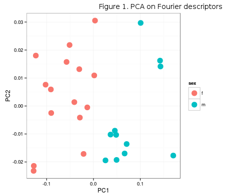
Continuing on the post about the climate data extraction in R, this post demonstrates a simple approach to using PLS (partial least squares) for determining the common covariance patterns between morphology and mean monthly temperature (although the model is likely to be bad). Morphology data can be found here. This dataset only contains PCA scores of individuals for the first two PC axes (Figure 1), extracted from the Fourier descriptors of horn shape. PC1 axis (92%) clearly separates males and females on the basis of respective horn shape.

Temperature data are extracted using geoTiffs from WorldClim database, as in the mentioned post about climate data extraction. The ready-made dataset of mean monthly temperatures for the above study locality can be found here.
1 2 3 4 5 6 7 | |
PLS analysis is a useful multivariate technique used for determining the common variation patterns in two blocks of data and is sometimes reffered to as PLS regression. In this post, of all PLS implementations in R, the choice is on the fabulous plsdepot library, developed and maintained by Gaston Sanchez, whose blog/personal page and work in general was a great insipiration for Creative Morphometrics. His approach is very well explained and documented over at his page, so only direct implementation on the data above will be provided here.
1 2 3 4 | |

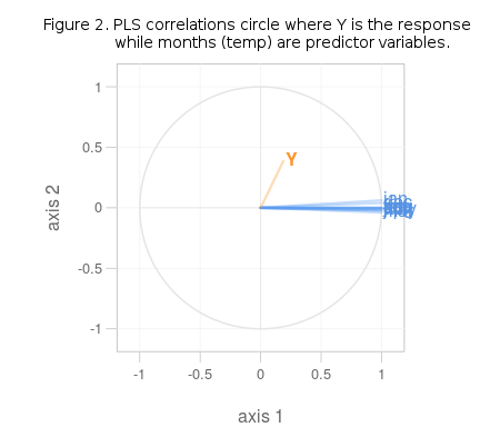
It is obvious from Figure 2. that the variables in question share no common variation pattern and are totally unrelated. If the chosen data was better, some of the blue lines (predictors) would run parallel with the orange one (response). If the R2 value for this model is examined (it is a part of climatePLS object – climatePLS$R2) the unrelatedness of predictors and response in this model gets even more obvious (R2 = 0.035). Predictors in this model are also highly correlated within themselves, which renders them rather useles in prediction, as was stated at the onset.